CSS 변이와 변형 (transition and transform)
CSS 에서 transition 과 transform 을 잘 사용하면 동적인 웹을 만들 수 있고 사용자의 UX 도 만족시켜줄 수 있는 좋은 친구이다. 자주 쓰고 있지만 헷갈릴 수 있어 이 참에 정리 해보려 한다.
변이 (transition)
변이는 CSS 프로퍼티의 값이 변경될 때 일정 시간에 걸쳐 변화되게끔 하는 것이다.
예를들어 100px 에서 200px 로 변형되는 상태가 있다고 할 때 transition 의 값을 주어 천천히, 혹은 빠르게 등 어떻게 변화를 할 건지 속성을 정해준다.
프로퍼티들
transition-delay
변이를 시작하기 전 몇초의 시간을 두고 시작할 것인지 정한다.
foo {
  transition-delay: 0.3s
  transition-delay: 300ms
  transition-delay: .3s
}
/* 셋 다 0.3초 후 시작 */
transition-duration
변이할 총 시간을 지정해준다.
foo {
  transition-duration: 0.3s;
}
transition-property
변이할 css 프로퍼티 이름을 정해준다. 다중선택은 콤마(,)로 구분한다.
foo {
  transition-property: background-color;
  transition-property: background-color, color;
  transition-property: background-color, margin-right, color; /* 다중선택 */
  transition-property: all; /* 전부 다 지정 */
  transition-property: none; /* 아무것도 지정 안 함 */
}
transition-timing-function
변이의 시작부터 끝까지 어떠한 함수를 이용해 변이할건지 함수를 지정해준다. 다음 문서를 참고하면 좋습니다.
각각의 키워드 그래프는 다음 그림의 형태로 변이합니다. 그 외에 cubic-bezier 를 이용시엔 해당 사이트를 참고한다.
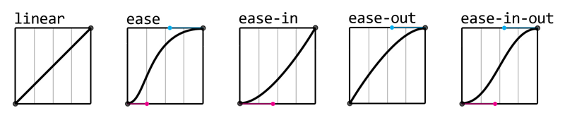
foo {
  /* 키워드 값 */
  transition-timing-function: linear;
  transition-timing-function: ease-in;
  transition-timing-function: ease-out;
  transition-timing-function: ease-in-out;
  transition-timing-function: step-start;
  transition-timing-function: step-end;

  /* cubic-bezier 사용 */
  transition-timing-function: cubic-bezier(0.1, 0.7, 1, 0.1);
}
transition
transition 은 transition-property, transition-duration, transition-timing-function 과 transition-delay를 한번에 쓸 수 있는 단축 프로퍼티(shorthand)이다.
순서대로 기술하는것이 중요하다.
- 변이할 프로퍼티이름
- 몇초동안 변이?
- 어떤 타이밍 함수 사용?
- 시작전 몇초 딜레이?
foo {
  transition: <transition-property> | <transition-duration> |
    <transition-timing-function> | <transition-delay>;
}
변형 (transform)
변이는 상태의 변화시간을 조절했는데 말그대로 변형은 어떻게 요소를 변형할건지에 대해 기술한다.
프로퍼티들
transition-origin
변형의 기준점을 잡아준다. 기본값은 요소의 중앙이다.
foo {
  transform-origin: center; /* default */
  transform-origin: top left; /* 위 왼쪽 */
  transform-origin: 50px 50px; /* (0, 0) 을 기준으로 50px 씩 떨어짐 */
}
transform
본격적으로 변형을 어떻게 줄 것인지 적어주는 프로퍼티다. 다중변형을 사용하고 싶은 경우엔 공백(space) 를 이용해 기술해준다.
foo {
  transform: rotate(90deg); /* 단일 변형 */
  transform: rotate(90deg) translateX(20px); /* 다중 변형 */
}
목록
- none
- matrix()
- translate()
- translateX()
- translateY()
- scale()
- scaleX()
- scaleY()
- rotate()
- rotateX()
- rotateY()
- rotateZ()
- rotate3d()
- skewX()
- skewY()
- matrix3d()
- translate3d()
- translateZ()
- scale3d()
- scaleZ()
- perspective()
꽤 많은데 외우기보단 이런것들이 있는걸 인지한 상태에서 찾아서 사용하는게 맞는 듯하다. perspective 는 처음보는거라 링크를 걸었다. 쉽게 카메라처럼 생각해 요소를 어떤 각도에서 줌을 얼마나 땡길지 지정해주는 듯 하다. 사용하는 경우는 그닥 없을 것 같다.